Monday, December 6, 2010

Art Show - SCA Project Gallery


Chants, Prayers and Poems:
Compound Visions of Healing


January 8 - February 5, 2011


Artists: Yvonne Beatty, Cynthia Friedlob, Hiroko Momii, Cindy Rinne, Linda Vallejo

Curated by Yvonne Beatty and Cynthia Friedlob

Five Los Angeles-based mature women artists of different ethnic backgrounds (European, African American, Asian and Native American/Hispanic) will exhibit artwork that reflects the wisdom found in The Navajo Night Chant, a Native American song that is both a tribute to natural phenomena and a prayer for healing. The purpose of the show is to bridge cultural gaps between the artists and our audience, encouraging us to come together to experience art that respectfully celebrates both our shared and our distinctive forms of spiritual expression.

SCA Project Gallery
281 S. Thomas Street, #104
(lower level of Founder's Building)
Pomona, CA 91766
909-865-0252
Gallery Hours: Th/Fr/Sat from Noon – 4:00 p.m.

Opening Reception
January 8, 2011
6 – 9 p.m.

Art Walk Event
with poetry readings and Native American music
January 29, 2011
6 - 9 p.m.

Closing: Artists' Talks
February 5, 2011
1 - 4 p.m.

Please join us!

Saturday, September 25, 2010

Connections


I remain enamored with the series idea, so I made one called "Connections," one hundred small pieces that symbolize the interconnectedness of all things. Again, a colorful presentation appealed to me, so I used Prismacolor markers. I've given away only a few of these Connections as gifts. This is the first time samples from the series have been displayed publicly.


Connections #1

Connections #95

Connections #32
Approximately 2-1/4" x 3-1/4" watercolor paper
$20.00 each

Monday, August 9, 2010

Spirit Series: Rain, Moon, Mountain

Maybe because I grew up in the West I have an affinity for Native American art, especially the geometric shapes and the bright colors. The Spirit Series drawings reflect that appreciation. Here are three examples, all made with Prismacolor markers:


Spirit Series: Rain

14" x 11" custom matted & framed
Not currently available for sale


Spirit Series: Moon

approx. 9" x 12" watercolor paper
$250.00 unframed, free shipping U.S. only

Spirit Series: Mountain

approx. 9" x 12" watercolor paper
$250.00 unframed, free shipping U.S. only

Wednesday, August 4, 2010

Photo-Graphics - Introduction

Before the invention of color film, important black and white photographs were painstakingly colored by hand with oil paints or watercolors. When motion pictures first became popular, the audience would often see hand-colored lobby cards enticing them into the theater, although the movie they would watch was in black and white. But it's no surprise that when color film became affordable and readily available, hand-coloring (or "hand-tinting" as it was often called because of the subtlety of the colors) fell out of favor.

I've always enjoyed hand-colored photographs. I appreciate the work that went in to making them and they seem to have a magical quality that I find fascinating. I first became interested in the look when I was a child. In my grandparents' home was a beautifully hand-colored photograph of my mother, in profile, at the age of five or so. It now hangs in my home, still in its antique oval frame with convex glass, and still quite a mesmerizing work of art to this day. Years ago, when I decided to turn my attention to making art on a regular basis, naturally I was eager to try the hand-coloring process.

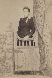
Using Marshall's Photo Oils and pencils, I began by working on vintage portraits, my own family's and many found at antique stores and photo collectible shows. The original photo was never touched; a matte-finish black and white copy would be made for coloring purposes. Copying also allowed enlarging the image when that was desirable. Many vintage photos have a sepia tint; copying removed that so that it wouldn't interfere with the coloring. Here's an example that shows how a vintage photo can be altered by hand-coloring:


Original sepia-toned photograph.


Black and white copy.
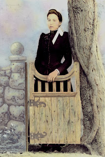


Hand-colored.

I love the ethereal quality that hand-coloring gives the picture. I like to keep vintage hand-colored images as close as possible to the integrity of their source, including using colors that I think are appropriate. But when I make reproduction prints of my original contemporary photos (and those made with my partner, John Semper Jr.) that I've hand-colored, occasionally computer-enhancement may be added to create significant changes to color balances and other more dramatic alterations with filters.

There is a selection of Vintage, Classic and Contemporary Photo-Graphics available on greeting cards in my Red Bubble shop. Original Classic and Contemporary photographs are being posted individually on this blog with links to order greeting cards and prints on each post.

Please feel free to comment or e-mail if you have questions about the hand-coloring process.

Communion


A meditative moment captured in a beautiful botanical garden. The original photo was shot and hand-colored in the 90s. Computer enhancement was added later to increase color vibrancy. This has been one of my most popular images and is a favorite of mine, too. The hand-colored photo was also a winner in an exhibition in Colorado in 1994.

Two of four remaining originals.
Price available on request.
Order prints and cards at Red Bubble.

So Far Away


A thoughtful, almost melancholy image taken on a chilly beach morning. The original photograph was shot and hand-colored in the 90s. Computer enhancement was done later for added color vibrancy. The original hand-colored photo won an award in 1994 in a Burbank, CA, gallery show.

SOLD
Order prints and cards at Red Bubble.

Green Haven


An inviting scene in a lush botanical garden. The original photo was taken and hand-colored in the 90s. Computer-enhancement was added later for great color vibrancy. I enjoyed working with so many different shades of green in this almost tropical image.

SOLD
Order prints and cards at Red Bubble.

The Modern Mandala Project

Throughout history, looking at a work of art has often been used as a way to focus the mind for meditation. However, I’ve often found that the process of making art can itself be a meditative experience. In 2004 I decided to embark on an artistic adventure and make a commitment to create a new, original drawing every day for one year as my daily meditation practice. I called this adventure “The Modern Mandala Project.”

The process began on April 18, 2004 and continued through April 17, 2005. Each Daily Meditation drawing was created using Prismacolor pens on 6”x9” watercolor paper. Each finished work was initialed and dated on the front. The drawings are shown with a black border for display purposes only; they are not matted or framed. Here are two samples:


The connected lines and geometric shapes used in these unique drawings reflect our universal, very human need to define relationships and create order. The bright colors are a joyful affirmation of life. Making the drawings helped to focus my mind; it’s my hope that viewing them will give you the same benefit. In that way they can become “Modern Mandalas.”

If you are interested in purchasing a Daily Meditation for a particular date, please contact me to see if it's still available.

Each drawing: $100.00 unframed, unmatted
Available in my Etsy shop.

Waiting


The original black and white photograph was shot in 1970 by my partner, John Semper Jr. I hand-colored it in the 1990s. Each brick was individually hand-colored with Marshall's pencils. Further computer enhancement was added only recently, making the image more vibrant and compelling.

Price available by request.
Order prints and cards at Red Bubble.

The Corner


The original black and white photograph was shot in 1970 by my partner, John Semper Jr. I hand-colored it in the 1990s. Each brick was individually hand-colored using Marshall's pencils. Further computer enhancement was added only recently, making the image more vibrant and compelling.

Price available by request.
Order prints and cards at Red Bubble.

Glow


The original black and white photograph was shot in 1970 by my partner, John Semper Jr. I hand-colored it in the 1990s. Further computer enhancement was added only recently, making the image more vibrant and compelling.

The sky was a flat, light gray in the original photo; I added a dynamic treatment to complement the minimalist image.

Price available by request.
Order prints and cards at Red Bubble.

Tuesday, August 3, 2010

Ghost


The original black and white photograph was shot in 1970 by my partner, John Semper Jr. I hand-colored it in the 1990s. Further computer enhancement was added only recently, making the image more vibrant and compelling.

There's something fascinating to me about derelict buildings. What life did this old place have in the past?

This photo and "The Landmark" are two of my favorites. The originals are framed together and hang in our home.

Price available by request.
Order prints and cards at Red Bubble.

The Landmark


The original black and white photograph was shot in 1970 by my partner, John Semper Jr. I hand-colored it in the 1990s. Further computer enhancement was added, making the image more vibrant and compelling.

I like the reflections in the window. I always think that the customer is probably a landmark, too.

This photo is one of my favorites. The original is framed together with "Ghost" and hangs in our home.

Price available by request.
Order prints and cards at Red Bubble.

Angles


The original black and white photograph was shot in 1970 by my partner, John Semper Jr. I hand-colored it in the 1990s. Further computer enhancement added later made the image more vibrant.

The sky on the original photograph was a flat, light gray; I created something more interesting to match the drama of the image.

Price available by request.
Order prints and cards at Red Bubble.

Sunday, August 1, 2010

Question: But Can She Draw?

Answer: Yes, a bit.

It was 1991 when I decided to devote my time to making art and I thought I should see if I could still sketch. Granted, I'd made only a few portrait drawings in my lifetime and was never formally trained, but I always felt I had a knack for art because I knew I had inherited the talent from my artistic father. He had also taught me the basics, from proportion to perspective, when I was just a kid. So I grabbed an album cover with jazz composer and singer Michael Franks on it and made my first five-minute sketch. I figured that imposing a time limit on myself would prevent over-thinking it. I was pleased that I was able to get at least a very rough likeness that quickly.


Also in 1991, I saw a photograph of a Noh actor looking at his mask prior to a performance. The intensity of his concentration as he got into character was fascinating, so I decided to make a drawing. This time it was my artistic partner, John, who explained the concept of volume to me.


I love this little girl's freckles! This quick sketch was also made in 1991 and was my first attempt using colored pencils. I discovered that adding the element of color to a drawing would require a new way of thinking.


In 1992, I made this sketch of our young friend, Sophie, who lives in New Mexico. I find it hard to believe that so much time has passed. She will be thirty in just a couple of weeks.


Soon I turned my attention to making other types of art and sketched rarely after those first few years. But I was a fan of "American Idol" and thought it would be fun to draw the irascible Simon Cowell. Coincidentally, I also had the pleasure at that time of meeting all of the "American Idol" judges and the final "Top Ten" contestants at a Television Academy event -- this was way back in season two (2003). It will undoubtedly come as a surprise to many people that Simon Cowell is a very charming gentleman in real life, quite unlike the guy on screen during the show. This drawing depicts him suffering through yet another horrible audition. I enjoyed trying to capture him in colored pencil using an experimental swirly mix of color. Looking at it now, I'm quite tempted to refine the technique.


I've made only a few portrait sketches since then and will try to track them down to post. It's probably time to draw more, too; I seem to make a few new ones every decade! I wonder sometimes what might have happened had I studied art seriously and worked on realistic drawing and painting. It's never too late to learn, so maybe I'll find out. . . .

Monday, July 26, 2010

What Are Image Transfers?

My image transfers are one-of-a-kind works of art that are made from a pull-apart film and a slide printer that transfers images from slides onto the film. (I've used the now discontinued Polaroid 669 film; Fuji FP100c is currently available and I look forward to trying it.)

The film is exposed and pulled from the holder. After waiting for about ten seconds, the film is pulled apart and the negative is placed face down on watercolor paper that has been soaked in preparation for the process. A brayer is used to apply pressure to the negative on the paper for at least two minutes. The negative is then gently peeled from the paper and the photo transfer is allowed to dry.

The process is highly unpredictable and multiple transfers made from the same original slide image have subtle, and sometimes not so subtle, distinctions. The transfers have a relatively soft focus and an unsaturated palette. I often enjoy enhancing the colors on the dry prints with watercolor paints. The final image has a vintage feel that I find very appealing.

The image transfers are 4”x3”. I once showed them to a gallery director who referred to them as “little jewels,” an apt description, I think!

Please e-mail or comment if you have questions.

Japanese Bridge

Beautiful traditional Japanese garden bridge over a pond.

3"x4" custom mounted in 8"x10" sand-colored mat
Price list available on request.

Tiered Lantern


Stunning tiered stone lantern in a Japanese garden.

4"x3" custom mounted in 10"x8" sand-colored mat
Price list available on request.

Birdhouse

Charming rustic birdhouse in a botanical garden.

4"x3" custom mounted in 10"x8" sand-colored mat
Price list available on request.

Stone Fountain

One arm of a gorgeous stone fountain at a botanical garden.

3"x4" custom mounted in an 8"x10" mat
SOLD

Pampas Grass

Large stand of pampas grass at a botanical garden.

4"x3" custom mounted in 10"x8" sand-colored mat
SOLD

Garden Urn

Ornate stone urn at a botanical garden.

4"x3" custom mounted in 10"x8" sand-colored mat
Price list available on request.

Garden Chair

Imposing stone chair in a botanical garden.

4"x3" custom mounted in a 10"x8" sand-colored mat
Price list available on request.

Lantern

Lovely stone lantern in a Japanese garden.

4"x3" custom mounted in a 10"x8" sand-colored mat
(two originals available)
Price list available on request.

Elements: An Eco Art Conference

The Pacific Region Women's Caucus for Art sponsored "Elements: An Eco-Art Conference" in June at the David Brower Center in Berkeley, CA. Part of the conference, which included workshops, tours, films and other events, was an online postcard art show. I participated with three digital postcards about water:


The truth is that water is more valuable than gold.


We forget that the water cycle and the life cycle are one ~
Jacques Cousteau


When the well is dry, we know the worth of water. ~
Benjamin Franklin

Umbrella Art

One of four postcards featuring umbrellas.

International Mail Art Exhibition
in Honor and Memory of Judith A. Hoffberg
June 27 - August 22
Armory Center for the Arts
The Caldwell Gallery

I made four clip art postcards and a "newsletter" (see more below), all sent by snail mail, as required, for the final exhibition curated by Jay Belloli at the Armory. From the website and press release:
 
The International Mail Art Show is a massive, global mobilization: nearly 800 pieces of mail art from more than 25 countries representing every continent (except Antarctica)... a touching and monumental tribute to the late great Judy Hoffberg.
 
Judith A. Hoffberg (1934-2009) was an avid and active promoter of mail art and artists’ books. She was editor and publisher of "Umbrella," a newsletter devoted to all manner of art publishing and art exhibitions. In addition to Judith’s work as a librarian, archivist, lecturer and curator, she gave unstintingly of her time and energy to promote artists through her encouragement and connections in the art world. All mail art included in the exhibition will be donated to the Judith A. Hoffberg Archive at the Library, University of California, Santa Barbara, with the permission of the artists.
 
Here are my other three postcards:


Here are the cover and the three pages of the "newsletter":


Sunday, July 25, 2010

Dance


Sometimes the simplicity of drawing with pen and ink is so appealing to me. Lovely blank paper offering endless possibilities. Straightforward expression of emotion with the pen. In this piece I wanted to capture the feeling of a dancer's movement and the rhythm of the music that inspired the dance. I like the energy of this one-of-a-kind pen and ink drawing.

13-1/2"x16-1/2" custom matted & framed in black
$350.00 free shipping, U. S. only

Orchestra


There's nothing like the experience of hearing live music and, for me, nothing quite as moving and powerful as a live, full orchestra. The textures and layers of instruments can completely envelop and transport an audience. I tried to convey that mysterious, beautiful complexity in this original, one-of-a-kind pen and ink drawing.

13-1/2"x16-1/2" custom matted & framed in black
$350.00 free shipping, U.S. only

No Zen


Sometime in the late 18th or early 19th century, a Japanese artist named Sengai Gibon created an ink on paper work of art called simply "Circle, Triangle, Square." His drawing (one of each of the three shapes) is very popular and is reproduced frequently in books and posters. Author David Rosand has stated that "...the image has given rise to many explanations of the 'meaning' of its components, ranging from heaven, man and earth to three forms of Buddhism, but the image transcends specific symbols."

I think that the image resonates with us because these the three basic shapes are so familiar to everyone, no matter what our background or cultural heritage. My drawing playfully turns the tables on those familiar, comfortable shapes by letting them run wild. Clearly not a reflection of what we usually consider "zen." And yet, perhaps...

13-1/2"x16-1/2" custom matted & framed in black
$350.00 free shipping, U.S. only

Map


Wouldn’t it be nice if life had a map? Clearly laid out roads, dangerous areas marked so that they could be avoided, pleasant detours identified. Sometimes that sounds very appealing.

Instead what we live with is total immersion in uncharted territory. The whole place seems to be covered in a dense fog that conceals plenty of obstacles and there are no roads at all.

Using the familiar circle/triangle/square symbols, this original, one-of-a-kind pen and ink drawing reflects the way we usually navigate through our world, thinking that we’re being logical, but really just leaping from one thing to another, grasping at the things that make us comfortable. Absurd!

How I yearn for a map.

13-1/2"x16-1/2" custom matted & framed in black
$350.00 free shipping, U.S. only

Mondrian


It would take far more space than I have available here to expound on the significance of Piet Mondrian to pure abstract art. I adore his rigid forms, his limited color palette, his almost clinical approach to abstraction. But while creating this tribute (yes, this drawing is a tribute to him, odd though that may seem) I speculated about what he might have thought had he lived another sixty years or so and how that would have affected his art. How would he have reacted to what computers can do now, or the explosion of the media, or scientific discoveries about the essence of matter and space? In this original, one-of-a-kind pen and ink drawing I eliminated all color and broke up the grid he preferred. What would he think if he were here now?

13-1/2"x16-1/2" custom matted & framed in black
$350 free shipping, U.S. only